
OUR WORK..
WHAT WE DO?
Marketing and designing
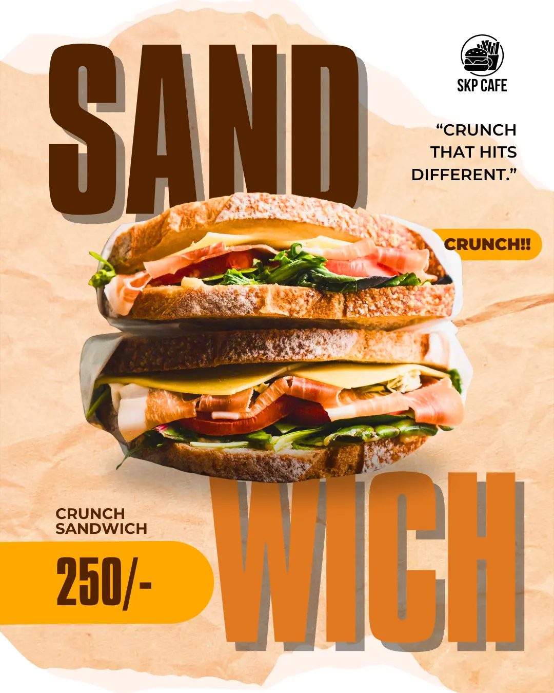
We carefully selected a cafe inspired color palette, structured the content for clear visual hierarchy, and designed the creative to reflect a modern food-brand identity while remaining simple, engaging, and conversion-focused.
Primary Colors:
Deep Coffee Brown: #4A2600
Warm Mustard Yellow: #FDB515
Secondary Colors:
Burnt Orange: #D87A2C
Toasted Bread Beige: #F5E6D3
Menu / Product showcase
Promotional banners
CTA-focused sections
AD CAMPAIGNS
LEMONADE (GREEK DRINK)
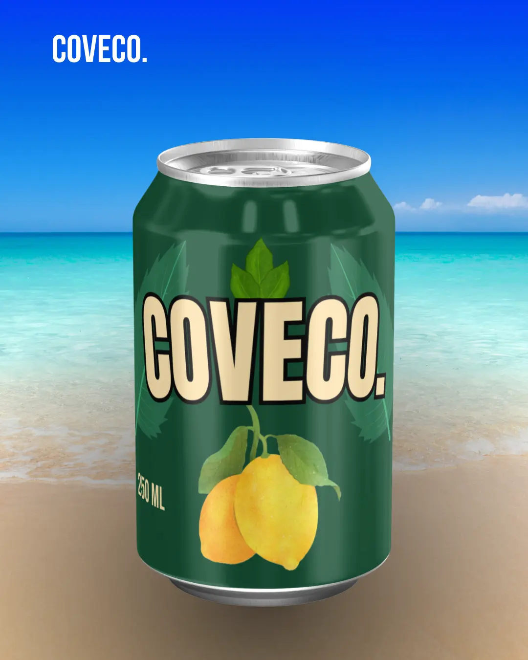
we developed high-impact static ad creatives with a clear product focus, placing the can at the center for maximum visibility in the feed. We designed the visuals using a nature-inspired color palette, bold and readable typography, and a calm yet refreshing background to ensure the ads stand out while scrolling.
Primary Colors
Deep Leaf Green (Can Base): #1F4D3A
Represents freshness, nature, and premium quality
Creamy Off-White (Brand Text): #F3E6C8
Ensures strong contrast and clean readability
Neutral & Utility Colors
Charcoal Black: #1A1A1A
For shadows, detailing, and depth
Pure White: #FFFFFF
For highlights and spacing
Metallic Silver (Can Rim): #CFCFCF
Used to simulate realistic aluminum texture

Menu showcase
Design showcase
The menu design was completed with a focus on clarity, visual appeal, and brand consistency. The objective was to create a layout that is easy to navigate while highlighting key items and pricing effectively. We used a balanced color palette, clean typography, and structured spacing to ensure readability across both print and digital formats.
Primary Colors
Bold Red (Headings, Prices, Icons):
#D71920
Used for MENU title, section headers, prices, and visual accents
Warm Beige (Background):
#E3C2A5
Creates a warm, café-friendly base and improves readability
Image Accent Colors (from food & coffee visuals)
Coffee Brown:
#5A3A2E
Golden Fry Yellow:
#E8B44C
Chocolate Brown (Desserts):
#4A2C2A
Foodie Sunday
Reel and Posts designs
we developed a series of high-impact poster designs and short-form reel creatives optimized for Instagram. Strong typography, dynamic layouts, and vibrant food visuals were used to instantly grab attention.All creatives were designed keeping platform guidelines in mind, ensuring clarity, strong visual hierarchy, and consistency across the brand’s Instagram presence.
